Power BI: Executive Dashboard Overview
Everything You Need to Know
Table of Contents
- Sample Executive Dashboard Visuals
- Example Dashboard Layout
- Data Sources & Integration
- Advanced Dashboard Features
- Best Practices for Dashboard Design
- Troubleshooting
- Additional Resources
Power BI Executive Dashboard: Unlocking Data-Driven Leadership
In today’s fast-paced business world, executives and CEOs face the constant challenge of making swift, informed decisions based on a flood of data from across the organization. Sifting through spreadsheets and static reports is no longer enough—leaders need real-time, actionable insights that are clear, comprehensive, and tailored to their strategic goals.
That’s where Power BI executive dashboards come in. Power BI is Microsoft’s powerful business intelligence platform, designed to transform raw data into visually engaging, interactive dashboards.
These executive dashboards consolidate key metrics—such as financial performance, sales trends, operational efficiency, and customer satisfaction—into a single, unified view. With intuitive visuals, dynamic filters, and seamless integration with tools like Salesforce, Google Analytics, and QuickBooks, Power BI empowers executives to monitor their organization’s health at a glance and dive deeper whenever needed.
This article will guide you through the essentials of Power BI executive dashboards:
- Why they are critical for modern leadership
- The types of dashboards and KPIs that matter most
- Real-world examples and best practices for design
- How to leverage Power BI’s advanced features for smarter, faster decision-making
Whether you’re a CEO, CFO, or business leader looking to harness the full potential of your data, this guide will show you how Power BI dashboards can drive efficiency, profitability, and sustainable growth—helping you stay ahead in an ever-evolving business landscape.
Sample Executive Dashboard Visuals
Executive dashboards in Power BI use a variety of visual elements to present key business metrics clearly and concisely. Below are interactive examples and sample data for each common visual type found in effective executive dashboards.
-
KPI Cards:
KPI cards display high-level metrics for quick insights.
-
Trend Lines:
Trend line charts illustrate changes in key metrics over time. -
Bar and Column Charts:
Bar and column charts compare performance across categories.
-
Pie/Donut Charts:
Pie and donut charts show proportional breakdowns of a metric.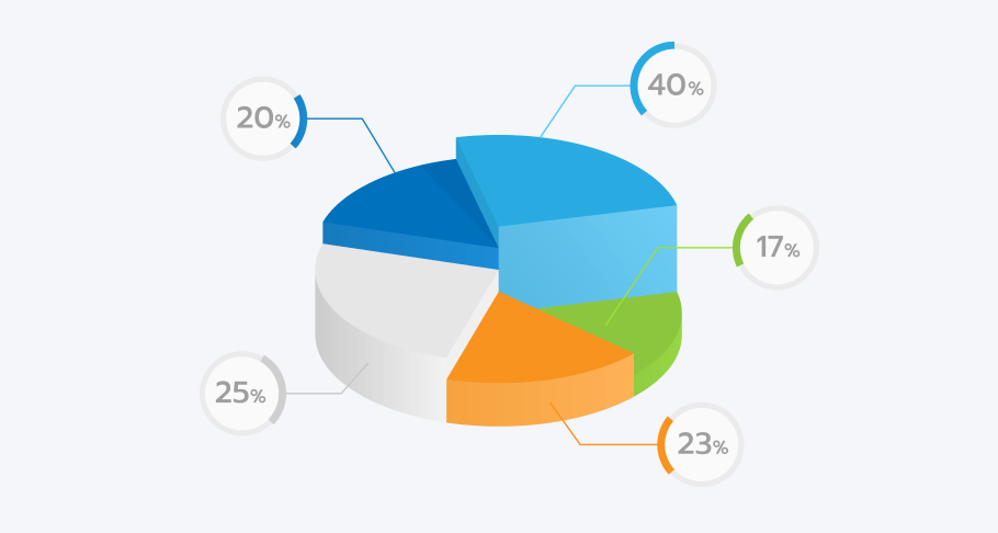
-
Heat Maps:
Heat maps highlight areas of high or low performance within datasets.
-
Geographical Maps:
Geographical maps visualize data by location for regional analysis.

Example Dashboard Layout
An effective executive dashboard is thoughtfully organized to present key information clearly and intuitively. Below is a sample layout illustrating common sections and the types of visuals typically included in each area of a Power BI executive dashboard.
| Section | Description | Sample Visuals |
|---|---|---|
| Executive Summary | Snapshot of top KPIs and percent changes with brief data stories. | KPI cards, summary text |
| Financial Overview | Revenue, profit, cash flow, and expense trends. | Line charts, bar charts |
| Sales & Marketing | Sales performance, customer acquisition, campaign ROI. | Funnel charts, bar charts |
| Operational Metrics | Production efficiency, inventory turnover, supply chain performance. | Heat maps, trend lines |
| Geographic View | Regional breakdown of sales or operations. | Maps, bar charts |
| Drill-down Details | Interactive elements for deeper exploration of underlying data. | Slicers, tables, filters |
This layout ensures executives can quickly grasp overall performance while having the ability to dive deeper into specific areas as needed.
Data Sources & Integration
A powerful executive dashboard in Power BI depends on seamless integration with a variety of data sources. Effective data integration ensures executives have a unified, real-time view of key business metrics, supporting informed and timely decision-making.
1. Common Data Sources for Executive Dashboards
- Databases: SQL Server, MySQL, Oracle, and other relational databases provide direct access to operational and transactional data.
- Cloud Services: Azure, Salesforce, Google Analytics, and other cloud platforms enable a holistic view of business operations and customer interactions.
- Files and Spreadsheets: Excel, CSV, XML, and similar files ensure that even offline or legacy data is included in analysis.
- Web APIs & Streaming Data: Integration with APIs, SharePoint, and streaming sources expands the dashboard’s reach and enables real-time monitoring.
- Third-Party Applications: QuickBooks, Marketo, and social media platforms can be connected for broader business insights.
2. Power BI Data Integration Techniques
- DirectQuery: Connects directly to the data source, fetching data in real time with every dashboard interaction. Ideal for large datasets and scenarios requiring up-to-the-minute information.
- Import Data: Copies data from the source into Power BI for analysis. Best for datasets that change infrequently or when performance is a priority.
- Live Connection: Maintains a live link to certain sources (like Analysis Services), keeping calculations and models in the source system.
- Hybrid Approach: Combines multiple methods to balance performance, freshness, and data capacity.
3. Power BI Integration Tools
- Power Query: Simplifies connecting, transforming, and cleaning data from various sources, making integration accessible to non-technical users.
- Power BI Desktop: The main workspace for importing, modeling, and visualizing integrated data before publishing dashboards.
- Power BI Service: A cloud-based platform for sharing, refreshing, and collaborating on dashboards and reports organization-wide.
4. Best Practices for Data Integration
- Data Quality and Cleansing: Validate, clean, and standardize all data before integration to ensure reliability and consistency.
- Data Modeling: Establish clear relationships between tables and use star schemas for optimal performance.
- Incremental Data Refresh: Schedule regular and incremental data refreshes to keep dashboards current without overloading the system.
- Data Governance: Implement permissions and access controls to ensure data security and compliance.
5. Executive Benefits of Robust Data Integration
- Holistic Business View: Consolidates diverse data for comprehensive, 360-degree insights.
- Timely Insights: Real-time or near-real-time updates enable quick, evidence-based decisions.
- Customization and Flexibility: Tailor dashboards to strategic needs with a wide range of connectors and integration options.
- Ease of Use: Intuitive interfaces and automation reduce reliance on IT for data access and reporting.
Advanced Dashboard Features
Power BI executive dashboards offer a range of advanced features that enhance data exploration, interactivity, and actionable insight for executives. These features go beyond static reporting, enabling leaders to drill deeper, ask questions in natural language, and integrate predictive analytics into their decision-making process.
1. Drill-Down and Drill-Through Capabilities
-
Drill-Down: Allows users to click on a visual element (such as a bar or segment) to reveal more granular data, like moving from yearly sales to quarterly or monthly figures. This helps executives uncover trends and outliers at different levels of data hierarchy.
Example: Click on a region in a sales chart to see sales by city within that region. -
Drill-Through: Provides the ability to right-click on a data point and navigate to a detailed report page focused on that context, such as viewing all transactions for a specific product or department.
Example: Right-click on a product category to access a detailed breakdown of sales transactions for that category.
Tip: Ensure drill-through pages are contextually relevant and easy to navigate back from.
2. Real-Time Data and Automatic Refresh
- Real-Time Dashboards: Power BI supports real-time data streaming and scheduled refreshes, ensuring executives always see the most up-to-date metrics for timely decisions.
- Automatic Alerts: Set up data-driven alerts to notify users when KPIs cross predefined thresholds, enabling proactive management.
3. Natural Language Q&A
-
Ask Questions in Plain English: Executives can type questions (e.g., “What were total sales last quarter?”) into the Q&A box, and Power BI responds with the most relevant visual or metric.
Benefit: Makes data exploration accessible to non-technical users and speeds up insight discovery.
Note: Q&A adapts the visual type based on the data and question context.
4. Predictive Analytics and Machine Learning
- Forecasting: Built-in forecasting tools allow executives to visualize future trends based on historical data.
- Azure Machine Learning Integration: Integrate advanced analytics and custom models for deeper insights, such as customer churn prediction or sales forecasting.
5. Custom Visuals and Data Blending
- Custom Visuals: Use marketplace or custom-developed visuals (including those built with R or Python) to represent complex data in intuitive ways.
- Data Blending: Combine data from multiple sources for a unified view, enabling executives to correlate metrics across departments and platforms.
6. Mobile Optimization and Accessibility
- Responsive Design: Dashboards adapt to different screen sizes, ensuring executives can access insights from any device, anywhere.
- Accessibility Features: Power BI includes options for screen readers and high-contrast modes, supporting inclusive data consumption.
Best Practices for Dashboard Design
Designing an effective executive dashboard requires more than just assembling charts and metrics. Following best practices ensures that dashboards are intuitive, actionable, and aligned with business goals. Here are key guidelines to maximize the impact of your Power BI executive dashboards.
1. Focus on Clarity and Simplicity
- Prioritize Key Metrics: Display only the most important KPIs and insights relevant to executive decision-making. Avoid clutter and information overload.
- Use Clear Visuals: Choose chart types that best represent the data and are easy to interpret at a glance.
- Limit Colors and Effects: Use a consistent color palette and avoid excessive use of gradients, 3D effects, or distracting animations.
2. Ensure Consistency and Alignment
- Standardize Layouts: Align visuals, labels, and spacing for a polished, professional appearance.
- Consistent Formatting: Use uniform fonts, sizes, and color schemes throughout the dashboard to reinforce brand identity and improve readability.
3. Design for Interactivity
- Enable Filters and Slicers: Allow executives to segment data by time period, region, or business unit for customized analysis.
- Incorporate Drill-Downs: Provide interactive elements that let users explore underlying data without leaving the dashboard.
4. Provide Context and Guidance
- Add Titles and Descriptions: Clearly label each visual and section so users understand what they are viewing.
- Use Tooltips: Offer additional information or definitions when users hover over data points.
- Highlight Trends and Comparisons: Use color coding or annotations to draw attention to significant changes or variances.
5. Optimize for Performance and Accessibility
- Minimize Load Times: Limit the number of visuals and data points to ensure the dashboard loads quickly.
- Design for All Devices: Ensure dashboards are responsive and usable on desktops, tablets, and smartphones.
- Support Accessibility: Use high-contrast colors, readable fonts, and screen reader-friendly layouts.
6. Gather Feedback and Iterate
- Solicit User Input: Regularly collect feedback from executives and stakeholders to identify areas for improvement.
- Continuously Refine: Update dashboards based on feedback, changing business needs, and evolving data sources.
Additional Resources
Building and optimizing executive dashboards is an ongoing process. To help you create dashboards that deliver real business value, explore these recommended resources, best practices, and examples from industry leaders.
1. Curated Best Practices for Executive Dashboards
-
Customize Your Display: Focus on three to five critical metrics tailored to your audience. Display only the most relevant data to avoid clutter and ensure clarity.
Source: ActivTrak -
Keep It Simple: Use clear, concise visuals and avoid unnecessary complexity. Simplicity helps executives quickly interpret data and take action.
Source: ActivTrak, mrc-Productivity -
Automate Updates: Schedule regular data refreshes or automated report deliveries to maintain up-to-date insights.
Source: ActivTrak -
Start with Clean Data: Ensure your data is accurate and well-organized before building your dashboard.
Source: mrc-Productivity -
Iterate and Gather Feedback: Continuously improve your dashboard by collecting user feedback and making iterative enhancements.
Source: mrc-Productivity -
Tell a Story: Organize data to support a clear narrative, placing the most important metrics in prominent positions (such as the top left).
Source: mrc-Productivity -
Include Goals and Checkpoints: Provide context by showing targets and progress, so executives know whether they are on track.
Source: mrc-Productivity -
Make the Dashboard Proactive: Use alerts and automation to notify users of significant changes or issues, even when they're not actively viewing the dashboard.
Source: mrc-Productivity
2. Types and Examples of Executive Dashboards
-
Strategic Dashboards: Focus on long-term goals and high-level metrics like revenue growth and customer base trends.
Source: Asana -
Analytical Dashboards: Designed for deep dives into historical data, trend analysis, and forecasting.
Source: Asana -
Operational Dashboards: Monitor short-term processes and real-time performance, such as project budgets or daily sales.
Source: Asana -
Tactical Dashboards: Track team or project performance with actionable metrics like productivity or cost per hire.
Source: Asana -
Industry Examples: Explore dashboards for HR analytics, IT performance, sales, and more for inspiration and best practices.
Source: Shiny, Qlik
3. Key Questions for Dashboard Planning
- Who is the primary audience for this dashboard?
- What are the main business goals or KPIs to track?
- How will the dashboard support decision-making and drive action?
- What data sources are needed, and how will data quality be ensured?
- How often should the dashboard be updated or reviewed?
4. Further Reading and Templates
- Power BI Executive Dashboard Templates: Microsoft and third-party providers offer ready-to-use templates to jumpstart your dashboard project.
- Industry Case Studies: Review real-world executive dashboard examples from leading organizations for ideas and proven strategies.
- Dashboard Design Guides: Explore documentation and best practice guides from BI software vendors and thought leaders.
Conclusion
Throughout this post, we’ve explored the essential components of building an impactful executive dashboard in Power BI. We started with an overview of what executive dashboards are and why they matter, then examined sample visuals that bring data to life for business leaders. You learned how to structure a dashboard layout for clarity and effectiveness, and how integrating diverse data sources ensures a holistic, real-time view of your organization.
We also covered advanced dashboard features—like drill-downs, real-time updates, and predictive analytics—that empower executives to move from insight to action. Best practices for design were highlighted, emphasizing clarity, consistency, interactivity, and accessibility. Finally, we provided additional resources and questions to guide your dashboard journey, ensuring you have the tools and inspiration needed to create dashboards that truly drive business value.
Key Takeaways:
- Focus on the metrics that matter most to your executive audience.
- Use clear, intuitive visuals and maintain a consistent, professional layout.
- Integrate data from multiple sources for a comprehensive perspective.
- Leverage advanced features and interactivity to enable deeper insights.
- Continuously gather feedback and refine your dashboards to meet evolving business needs.
Thank you for joining us on this exploration of executive dashboards! Whether you’re just getting started or looking to enhance your existing dashboards, we hope these insights and best practices help you unlock the full potential of your data. If you have questions or want to share your own dashboard experiences, feel free to leave a comment below. Happy dashboarding!